A Shopify website redesign should do more than refresh your store’s appearance. It should bring together a considered theme, clearer navigation, a smoother customer journey, conversion-focused improvements and pre-launch testing, so your storefront works as a coherent sales system.
For Hong Kong SMEs and startups, that matters when an existing store no longer reflects the brand, makes products difficult to find or supports expansion into overseas markets. A new visual direction can help, but growth depends on how well the design connects brand positioning with the way customers browse, compare and buy.
This article explains what a redesign can include and how each element contributes to a more effective Shopify store. You’ll see how theme and navigation choices shape the experience, where landing pages and conversion improvements fit, what pre-launch testing should cover, and how to assess the work as a connected investment in your business.
Key Takeaways
- Decide whether to refresh your existing Shopify theme or pursue a new design based on how well the current store supports your brand and growth plans.
- Use templates and reusable sections to create a consistent storefront while giving key pages the structure they need.
- Make calls to action, product discovery and the buying journey work together to reduce friction for customers.
- Align navigation and product categories with your brand so local and overseas shoppers can find what they need more easily.
- Plan pre-launch testing to catch usability and storefront issues before the redesigned experience goes live.
What’s included with a Shopify Redesign?
A Shopify redesign combines a visual refresh with decisions about navigation, page structure and store functionality. The scope can range from refining an existing theme to creating a new design, followed by testing before launch.
Store Refresh Approaches
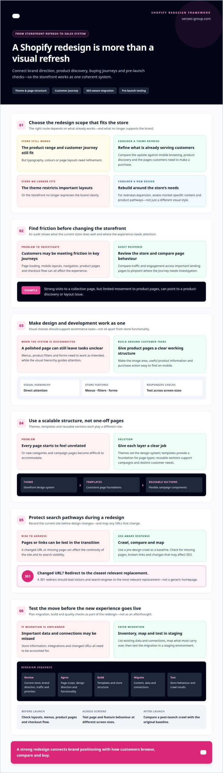
An existing Shopify theme may suit a store whose product range and customer journey still work, but whose typography, colours or page layouts need refinement. A new design makes more sense when the current theme restricts important layouts or no longer expresses the brand clearly. Compare the options by considering mobile browsing, product discovery and the pages customers need to make a purchase.
There’s no fixed refresh schedule for every store. A fresh theme is often considered every few years, but the decision should follow evidence: changing brand direction, a growing catalogue, new markets or recurring usability problems. A Hong Kong store expanding overseas may need clearer market-specific content and product pathways, not simply a different visual style.
Performance, Traffic, and Design Audits
An audit establishes what the current Shopify store already does well and where customers encounter friction. The team reviews page loading, mobile layouts, navigation, product pages and checkout flow, then compares traffic and engagement across important landing pages. For example, strong visits to a collection page but limited movement to product pages can point to a discovery or layout issue.
Search visibility also needs a before-and-after record. A pre-design site crawl provides a baseline for comparing the redesigned site, helping identify missing pages, broken links and changes that may affect SEO. If a page URL changes, a 301 redirect should lead visitors and search engines to its most relevant replacement, rather than a generic homepage.
Design and Development Services
Shopify design and development should be planned as one system. Visual hierarchy directs attention, while development ensures menus, product filters, forms and other store features work as intended. A product page, for instance, needs a clear image area, useful product information and a purchase action that remains easy to find on mobile.
Custom landing pages and manageable sections can support campaigns or distinct customer needs without making every page feel unrelated. The team connects those components to the store’s theme and structure, then tests their behaviour across screen sizes. Design quality is not decoration alone: it is how visual choices support ecommerce tasks.
Redesign Planning and Timeline
A professional redesign starts with a review of the existing store, brand direction, traffic patterns and business priorities. Next, the team agrees on page scope, design direction and required functionality before building templates, migrating content and testing the result. You can help planning by providing brand assets, product information, access to relevant store systems and decisions on priority markets.
There’s no reliable universal duration for a redesign. The timeline depends on the number of page types, custom functionality, content readiness, integrations and how quickly decisions are made. For Hong Kong businesses serving overseas customers, market-specific content and product arrangements can also affect scope.
To choose an agency in Hong Kong, assess its Shopify design process, development capability, SEO-aware URL planning and testing approach. Ask how the proposed work connects brand positioning with store performance, rather than judging visual concepts alone.
For safer data and integration migration, the agency should inventory the store’s existing data and connections, map what must carry over, and test the migration in a staging environment. A pre- and post-launch crawl can help surface missing URLs; mapped 301 redirects should point changed addresses to their closest relevant pages.
How a Shopify redesign agency uses themes, templates, and reusable sections
Themes set the storefront’s underlying design system; templates and reusable sections shape how individual pages serve customers. A professional connects these elements to the store’s product range, brand and growth plans.
Theme Selection and Scalability
Theme selection starts with the store’s requirements, not a visual preference alone. A professional considers catalogue structure, product filtering, navigation, campaign pages and the customer journey. For a Hong Kong retailer selling both locally and overseas, the theme should support clear product discovery and market-specific content as the business expands.
A theme preview helps assess layouts using the store’s own products, images and copy. Quality assurance then checks that menus, product cards and page elements behave as expected. The right choice gives the business room to add new categories and campaign pages without forcing every change into a one-off layout.
Custom Themes and Liquid Development
When a standard theme cannot support a key brand or functional requirement, custom Shopify theme work can adapt the storefront. Shopify’s Liquid template language connects store data with page layouts. For example, a product template can present details and purchase options in a structure that fits the brand’s visual hierarchy.
Custom development should have a defined purpose. A professional identifies which elements need bespoke treatment, then builds and tests those changes within the theme. This keeps the work focused on the customer experience instead of adding code simply to make a store look different.
Templates and Reusable Sections
Templates give page types a consistent foundation. A collection template can organise product browsing, while a product template can prioritise imagery, descriptions and purchase actions. Reusable sections, such as promotional banners or editorial blocks, can then be arranged across relevant pages without rebuilding the same element each time.
This structure supports consistency and operational flexibility. A Hong Kong startup can update a campaign message or feature a new product range through manageable sections, while preserving the broader design system. The agency previews these elements across page types to catch mismatched spacing, content hierarchy or visual treatment before launch.
Responsive Themes and Mobile Usability
Responsive themes adapt layouts to different screen sizes, but that alone doesn’t guarantee a clear mobile journey. A professional tests practical tasks, such as opening navigation, browsing a collection and reaching product information. On a narrow screen, an oversized banner can push essential details too far down the page.
Quality assurance covers theme previews on mobile and desktop, with attention to readable text, image cropping, tap targets and page flow. The team also checks that reusable elements remain useful on smaller screens. A clear menu and visible product details make the store easier to navigate for customers browsing on the go.
When theme choices need to align with a stronger brand system, Shopify store design can bring visual identity and storefront structure into the same conversation.
Conversion optimisation and calls to action
Conversion optimisation aligns each page with the customer’s next decision. A Shopify store should make the route from landing page to product details, cart and checkout clear. For example, a campaign page for a skincare set can lead with its key benefit, show the included products, then present a visible purchase action.
Calls to action work best when their wording matches the page’s purpose. “Shop the collection” fits a category page; “Add to cart” belongs beside a specific product. The design should establish a clear visual hierarchy, so customers can distinguish the main action from supporting links such as size guides or delivery information.
Landing pages need to match the campaign or search intent that brought visitors there. If an advert promotes a particular product range, the page should feature that range rather than send visitors to a broad homepage. This consistency helps customers understand the offer and take the next step without searching through unrelated categories.
A conversion-rate optimisation review examines the journey through customer behaviour and page performance. The reviewer can compare landing-page engagement with product views, cart activity and completed orders, then identify where the flow weakens. For instance, product views without cart additions may point to unclear product information, hard-to-find options or an inconspicuous purchase action.
Changes should respond to a defined problem, not personal preference. A review might prioritise the product page, adjust the placement of delivery details, and compare the revised journey with the previous version. Reviewing one meaningful change at a time makes it easier to understand which page elements help customers progress.
Speed also affects the shopping experience and search visibility. Roughly 40% of users may abandon a website that takes more than three seconds to load. Large image files, unnecessary app features and complex page elements can slow a Shopify store, so performance reviews should assess these parts alongside page design.
Search engine optimisation belongs in the conversion plan because organic visitors need relevant landing pages, clear headings and useful product information. During a redesign, the professional can preserve valuable page destinations and ensure search-focused content supports the same customer journey. This matters for Hong Kong stores reaching local shoppers and overseas audiences through ecommerce.
After changes, usability reviews should test actual tasks on desktop and mobile. A reviewer can follow a product from landing page to checkout, checking that calls to action remain visible and links work correctly. The findings guide the next round of refinements, keeping conversion improvements grounded in how customers use the store.
Navigation, product categorisation, and branding
Store navigation should help customers understand what the business sells and where to find it. Product categories and visual identity should reinforce that structure, not compete with it.
Navigation and Store Layout
A redesign separates customer-facing navigation from the Shopify admin layout used to manage the store. On the storefront, the main menu should prioritise key destinations, such as new arrivals, product categories and customer support. In Shopify admin, clear product, collection and page organisation helps staff maintain that structure as the catalogue changes.
For a Hong Kong retailer expanding overseas, navigation labels should remain clear across markets. A professional reviews the existing menu, identifies overlapping destinations and maps a simpler route from the homepage to relevant products.
Collections and Product Pages
Collections group products around useful customer needs, such as product type, use or range. A homeware store might organise dining products separately from storage, then connect each collection to product pages with consistent imagery, descriptions and options.
Collection pages should make browsing manageable, while product pages answer the next buying questions. The design can prioritise product details, available choices and related items without crowding the page. This relationship helps customers move from broad discovery to a considered product decision.
Branding gives those paths a recognisable point of view. Colour, typography, photography and tone should reflect the same positioning across the homepage, collection pages and product details. If a premium tea brand uses restrained imagery and detailed origin stories, a loud discount-led design could undermine that signal.
Product categorisation also shapes how visitors interpret the offer. A beauty store could group products by routine, such as cleansing and moisturising, rather than relying only on internal product names. This translates the catalogue into a structure customers can understand, especially when the business serves different markets.
During a redesign, the team maps existing products to proposed collections before rebuilding menus. This can reveal duplicate categories, products with unclear placement and gaps between campaign pages and the main catalogue. Shopify collections then support the planned storefront structure, while page templates give each category a consistent presentation.
Brand consistency depends on more than repeating a logo. A Hong Kong fashion label, for example, can use a distinctive image style and consistent product naming across its homepage, collections and product pages. When visual and verbal elements work together, customers can recognise the brand as they move through the store.
The final review should test real journeys: homepage to collection, collection to product, and product back to related choices. The professional checks menu labels, page hierarchy and category links on desktop and mobile. This makes navigation a deliberate part of the brand experience, rather than a set of disconnected links.
Pre-launch testing and usability feedback
Pre-launch testing checks whether the redesigned store works for real customer tasks, not just whether its pages look finished. The team reviews usability, content, functionality and search visibility before publishing, then resolves defects that could disrupt shopping.
Redesigning a live Shopify store can introduce risks such as broken links, missing pages, faulty integrations and disrupted customer journeys. URL changes can also affect organic visibility if relevant redirects are overlooked.
User acceptance testing evaluates the store through practical scenarios. A tester might find a product, review its details, add it to the cart and proceed through checkout. The team records confusing labels, missing information and interface problems at each step, then assigns fixes before launch. Tests should cover customer-facing content and the administrative tasks staff need for routine store updates.
Functionality checks should include menus, search, collection filters, product options, forms and checkout. The team can test common combinations, such as browsing on a mobile screen and choosing a product option before adding it to the cart. Each integration also needs a purposeful check, since a marketing signup form or payment connection can fail independently of the page design.
Usability feedback can come from moderated sessions, heatmaps and session recordings. A heatmap may show visitors clicking a non-interactive image, while a recording can reveal where they pause or abandon a task. These signals help the team distinguish a visual preference from a genuine obstacle. Findings should be mapped to specific page elements and customer actions.
A/B testing compares alternative versions of a page element, such as two calls to action or different product image arrangements. The design team defines the question first, then compares how each version supports the same customer task. Product video can also clarify features; a 360-degree product view, for example, gives shoppers another way to inspect an item.
Before launch, the team reviews page rendering, links, content, mobile layouts and key store functions in the prepared environment. It also compares the redesigned site with the pre-design crawl, checking for lost pages and broken destinations. Once the review is complete, the approved site can be published and monitored for issues that appear in the live store.
A controlled launch reduces the chance of exposing unfinished layouts or overlooked errors to customers. The team should keep a clear record of tested journeys, resolved issues and remaining monitoring priorities. This gives store owners a practical basis for evaluating feedback and addressing problems after publication.
Plan your Shopify pre-launch testing with a structured review of store journeys, usability and launch readiness.
Senses Group: Ecommerce Shopify Store
Senses Group brings Shopify store development into a wider brand and marketing system. Its Ecommerce Shopify Store offering is suited to Hong Kong SMEs and startups that need a redesigned storefront to support clearer customer journeys, stronger product presentation or expansion into overseas markets.
Where the store’s visual direction needs greater consistency, Brand Strategy and Brand Identity Design can align positioning with the customer-facing experience. Klaviyo Email Automation can extend that experience beyond the storefront, connecting customer communications with the ecommerce journey. Together, these services address redesign foundations, from how the brand is presented to how the store supports ongoing engagement.
If your current Shopify store no longer supports your business direction, contact Senses Group to discuss your redesign needs.
Build the next stage of your store
A redesign is a strategic decision about how your business will meet its next stage of growth. Before work begins, define the commercial priority: sharpen your brand position, make the store easier to use, or prepare for a broader customer base. That priority gives every design and development decision a clear purpose.
A Shopify website redesign is most valuable when the storefront reflects the direction of the business, not only its current catalogue. Senses Group connects Brand Strategy and Brand Identity Design with Ecommerce Shopify Store development, helping Hong Kong businesses align their brand and online shopping experience.
Bring your growth priorities into the conversation, whether you’re refining your local position or preparing to reach overseas customers. Discuss your Shopify redesign with Senses Group and take a considered step toward a store built for what comes next.
Frequently Asked Questions
What is a website redesign?
A website redesign changes how a site looks, works or guides customers in response to updated business needs. It can involve a new visual identity, revised page structure, improved product discovery or updated functionality. For example, a retailer adding a product range may need more than refreshed colours: customers may also need clearer category paths and pages that explain the expanded offer.
What’s the difference between a redesign and a refresh?
A refresh updates the existing site’s presentation while keeping much of its structure and functionality. A redesign reconsiders those foundations, potentially changing page layouts, navigation and how customers complete key tasks. A store with a strong catalogue structure but dated typography may need a refresh. If customers struggle to find products or complete purchases, a broader redesign may address the underlying journey.
What does a Shopify website redesign include?
A Shopify website redesign can include reviewing the current store, defining priorities, planning page layouts, configuring or developing a theme, and preparing the updated storefront for launch. The scope depends on the store’s needs. A business with new product categories may need revised collection pages, while a brand entering overseas markets may also need clearer market-specific content and coordinated product presentation.
Shopify theme customization vs custom design: which is better?
Theme customization is often appropriate when an existing theme supports the store’s core requirements but needs tailored styling or layouts. Custom design is more suitable when the business needs a distinct structure or experience that the chosen theme cannot support effectively. The decision should account for the catalogue, brand direction, functionality and future changes. The better fit meets requirements without unnecessary complexity.
How can a Shopify redesign agency preserve SEO rankings during a redesign?
An agency can reduce avoidable search disruption by recording existing URLs and important pages before rebuilding the storefront. If a URL changes, a 301 redirect should send visitors and search engines to the closest relevant destination. For example, an old product page should lead to its replacement, not a general homepage. After launch, the store’s sitemap can help search engines discover updated pages.
How can a professional Shopify redesign improve conversion rates and mobile UX?
A professional can improve the shopping experience by aligning page content with customer intent and making essential actions easier to find on mobile. For example, a product page can present key details and options before secondary brand content, helping shoppers assess the item without excessive scrolling. Testing common tasks on smaller screens can reveal cramped controls, confusing layouts or steps that interrupt the buying journey.
What Shopify redesign costs and features are included in different plans?
It includes a review of the existing website, a potential navigation and customer-journey revamp, custom landing pages with manageable sections, testing, reviews and publishing the site live.