
A product page that looks polished can still leave a shopper unsure what to do next. Shopify product page optimization means shaping each page to answer buying questions clearly and make the next step easy, through useful product details, visible calls to action, mobile usability, strong imagery and credible reviews. For Hong Kong SMEs and startups selling locally or overseas, the goal is not simply a more attractive page. It’s a clearer path from interest to a confident purchase.
You may already be investing in traffic and presenting products with care. But if shoppers cannot quickly understand what they are buying, find the details that matter or locate the Add to Cart button on mobile, the page creates friction instead of resolving it. This article explains how to improve the elements that shape a buying decision and avoid common mistakes, from weak product imagery to reviews without useful context. Focus on changes that improve clarity and support growth across markets.
Key Takeaways
- Make the next step unmistakable: place a clear add-to-cart action where mobile shoppers can find it without friction.
- Use concise, original product copy to answer buying questions and connect relevant search terms naturally to customer needs.
- Show products accurately from useful angles, and write alt text that describes what each image helps shoppers see.
- Place genuine reviews and customer content where they can help shoppers assess trust and fit.
- Look beyond visual polish: unclear costs, generic copy, weak mobile usability, and missing product details can undermine a buying decision.
1. Clear calls to action and mobile usability
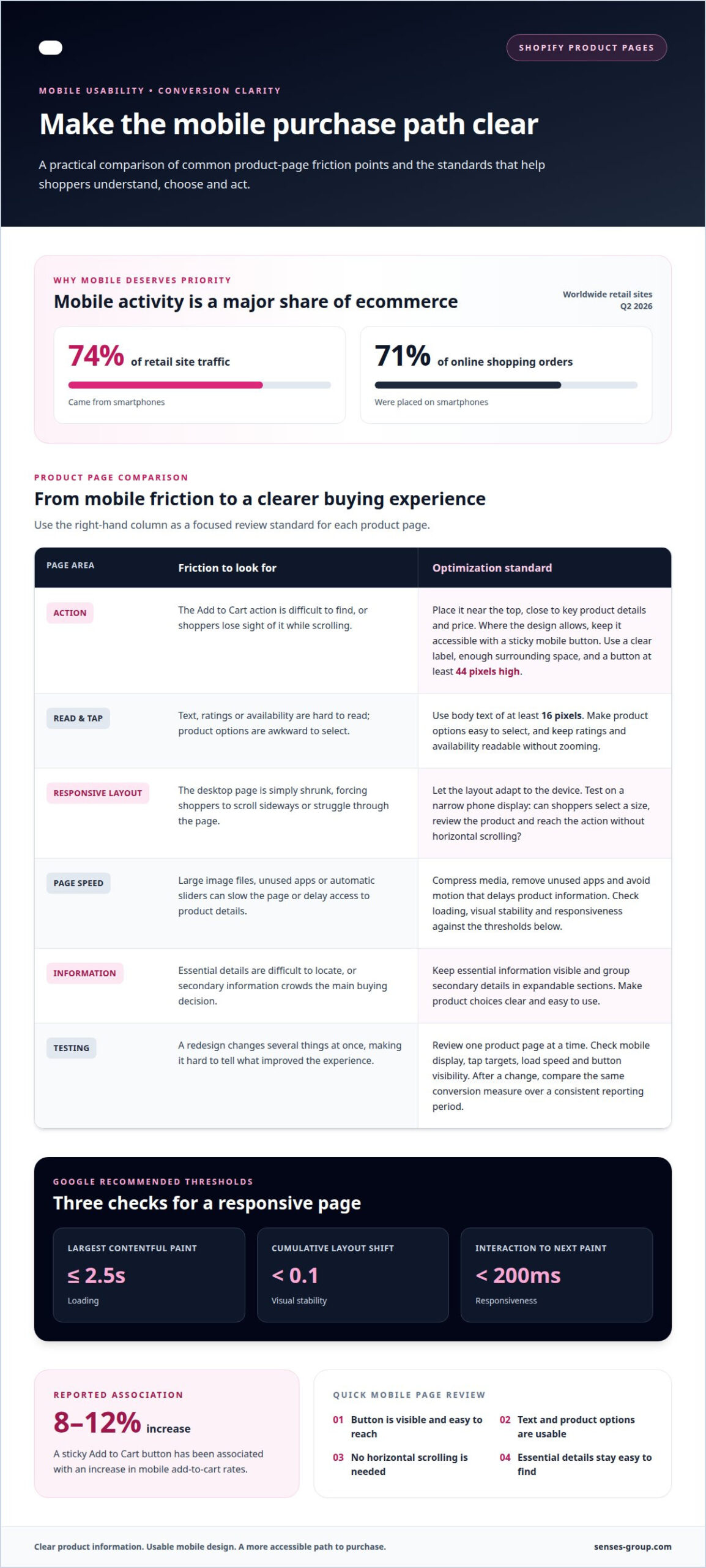
Key conversion factors include a visible add-to-cart action, usable mobile display, fast loading and clear product choices. For a retailer serving local and overseas shoppers, these elements need to work across different screen sizes, connection conditions and customer expectations. A responsive page adapts its layout to the device rather than simply shrinking the desktop version.
Start with the action shoppers need to take. Place the Add to Cart button near the top of the product page, where key product details and the price support the decision. Keep the action easy to reach as customers scroll, using a sticky button on mobile where the design allows. A sticky add-to-cart button has been associated with an 8-12% increase in mobile add-to-cart rates. Make the button at least 44 pixels high, with a clear label and enough space around it to prevent accidental taps.
Mobile usability depends on more than button placement. Use body text of at least 16 pixels, make product options easy to select, and ensure ratings or availability information remain readable without zooming. Test a product page on a narrow phone display: can shoppers select a size, review the product, and reach the action without horizontal scrolling? Keep essential information visible, while grouping secondary details in expandable sections.
Page speed shapes the same experience. Google’s recommended thresholds are a Largest Contentful Paint of no more than 2.5 seconds, a Cumulative Layout Shift score below 0.1, and Interaction to Next Paint below 200 milliseconds. These measures cover loading, visual stability, and responsiveness. Large image files, unnecessary apps, and automatic sliders can slow a Shopify page, so remove unused apps, compress media, and avoid motion that delays access to product details.
In Q2 2026, smartphones accounted for around 74% of retail site traffic worldwide and 71% of online shopping orders. Those figures make mobile-first testing a commercial priority, not a cosmetic refinement. Check how the page behaves when a video loads, a rating widget appears, or a shopper changes a product option. Each element should keep the layout stable and the purchase action accessible.
For practical improvements, review one product page at a time. Check its mobile display, tap targets, load speed and button visibility before changing the layout. After a change, compare performance using the same conversion measure and a consistent reporting period. This helps reveal whether an adjustment reduces friction or only changes the page’s appearance.
2. What is product page optimization?
Product page optimization is the work of making each page easier to find, understand, and act on. It connects search intent with useful descriptions, clear product details, and a consistent route to purchase. For a Hong Kong business serving local and overseas customers, each page should reflect the market’s language, currency, and buying questions.
Start with keyword research, then map each product page to a distinct customer need. Use relevant terms naturally in the product title, opening description, and metadata, rather than repeating keywords unnaturally. A product description can use one to two relevant keyword mentions per 100 words as a working guide. Search engines need clear context, while shoppers need specific answers about materials, dimensions, use, and care.
Describe customer benefits alongside accurate product features. Instead of listing only “cotton, relaxed fit,” explain how the fabric feels or how the cut fits, when those details are accurate. Put essential information first, then add supporting guidance. Original copy also helps distinguish a store’s pages from generic supplier descriptions. Keep every claim grounded in the product.
Titles and metadata serve different roles. The H1 is the main heading displayed on the product page; the title tag appears in search results. Keep product titles under 70 characters, meta titles under 60 characters, and meta descriptions under 160 characters. Use a descriptive product name in the H1, then write a distinct title tag that communicates the item and its differentiating detail. A concise meta description should set accurate expectations, not promise unsupported benefits.
For Hong Kong-facing stores, display the currency and language suited to the audience, and make shipping charges, delivery estimates, and relevant purchase terms easy to find. These details help shoppers assess the full purchase before checkout. Shopify apps and themes can add functions or change presentation, but the right choice depends on the page’s needs. Their prices vary by product and plan, so there is no single cost that applies to every store.
To optimize titles, descriptions, and images for SEO, align each page with a distinct search intent, use accurate descriptive copy, and provide concise alt text for product images. Measure page changes with a controlled A/B test: change one element, such as the title or description, then compare conversion rate and add-to-cart activity across equivalent traffic periods. Shopify product page optimization works best when those findings guide the next focused improvement. A coherent Shopify store structure can connect product pages, categories, and search intent.
3. Product image and alt text optimization
Product images help shoppers judge details that product descriptions cannot fully communicate. A ceramic cup, for example, needs images that show its profile, handle, glaze, and scale beside a familiar object. Use clear, well-lit photography with a simple background, then include close-ups where texture or finish affects the buying decision. Shopify recommends square product photos measuring 2,048 by 2,048 pixels. Consistent framing also gives a collection page a more structured display.
Plan an image sequence around customer questions. Start with a clear product view, then show useful angles, detail shots and an in-use example. For a bag, that might mean front, side and interior views, followed by a lifestyle image showing how it sits when carried. Video can demonstrate movement, scale or assembly, but should stay focused on the item. Each image or clip should add information rather than repeat the same view.
Match variant images to the option a shopper selects. When someone chooses a colour, show the corresponding product image rather than leaving an unrelated colour on screen. Keep variant labels, pricing, discounts and stock status near the selection controls. Show the selected colour name alongside its matching image, with the current price and availability easy to find. This gives customers useful information before they add the item to their basket.
Alt text makes an image understandable to people using screen readers and gives search engines useful context. The Food and Agriculture Organization of the United Nations recommends concise, accurate alt text describing each image. Name what is visibly present, such as “cream canvas tote bag with two long handles.” Avoid keyword strings, promotional claims, and details the image does not show. If several photos show the same product, describe each distinct view rather than repeating identical text.
Image SEO also depends on the surrounding page. Use descriptive file names before uploading, such as “canvas-tote-interior.jpg” rather than “IMG_1042.jpg.” Keep the product title and nearby copy aligned with what the image depicts. This connection helps organic search systems interpret the page without forcing keywords into every image description. Keep the original image clear, and compress files appropriately so visual detail does not create unnecessary loading weight.
For a Shopify catalogue with multiple products and options, use a consistent image workflow. Assign each product a lead image, supporting angles and variant-specific visuals, and write accurate alt text. After changing an option, review the live page to confirm the image, selected label, price and stock message match. This catches mismatches that can confuse shoppers and undermine confidence before purchase.
4. Reviews, testimonials, and user-generated content
Reviews help shoppers assess a product through another customer’s experience. BrightLocal’s 2026 survey found that 49% of consumers trusted online reviews as much as recommendations from a friend. Display a product’s rating near its title, then make individual reviews easy to find. A visible rating offers quick context; specific comments explain fit, use, or quality in greater detail.
Use reviews to answer real purchase questions. For instance, feedback about a bag’s capacity may help someone decide whether it suits everyday use. Present the reviewer’s words clearly, distinguish product feedback from general store feedback, and show critical comments honestly. Thoughtful responses can demonstrate that the business takes customer experience seriously, rather than relying on polished claims alone.
Customer photos and other user-generated content can add context to professional product photography. A shopper’s image might show how an item looks at home or how a garment fits outside a studio. Use content with permission, identify it as customer-submitted, and associate it with the correct product or variant. Add concise alt text when a description is needed, such as “customer photo of a ceramic mug on a wooden table.”
Trust signals should support the decision, not crowd the page. Place the average rating and review count near the product title, then show detailed reviews farther down. Make payment, delivery, and return information easy to locate before checkout. Baymard’s 2026 cart abandonment data found that 19% of shoppers who left for a reason beyond casual browsing did not trust the site with their credit card information. Clear, consistent purchase details help address that concern.
Return information deserves particular visibility. Baymard’s 2026 data found that 13% of shoppers who left for a reason beyond casual browsing disliked the return policy. State the applicable return window, conditions, and process in plain language, and link it near the purchase details. For Hong Kong businesses selling overseas, keep those terms clear for each audience. Avoid vague wording that leaves customers uncertain about who pays return delivery or how to begin.
Reviews can support visibility when they contain useful, original language about a product, but treat them as customer evidence, not a shortcut to search rankings. Keep reviews associated with the relevant product page and make ratings easy to read on mobile. Structured data can help Google understand product information, but accurate reviews and page details matter more than marking up content shoppers cannot see. Collecting and displaying authentic feedback makes social proof part of the buying experience.
5. Common product-page optimization mistakes
A polished page can still lose sales when its key elements contradict one another. Treating design, copy, search visibility and shopping behavior as separate tasks creates a deeper problem. The page should deliver one coherent promise, from the search result to the purchase action. If an ad promises a specific benefit, make that benefit easy to find and substantiate on the landing page.
Generic supplier copy is a frequent weakness. Reusing the same description found across several stores gives customers little reason to choose one business. Write original copy around the product’s actual use, relevant features, and customer benefits. Benefit-focused descriptions are reported to convert 30% higher than feature-only copy. For example, explain what a bag’s compartments help organize, rather than listing “three compartments” without context.
Another common mistake is writing for search engines instead of people. Repeating a target keyword in every heading can make descriptions awkward and hide the details shoppers need. Give each product page a clear search intent, then use related terms where they naturally describe the item. Search visibility can bring traffic, but accurate content helps visitors decide whether the product suits their needs.
Hidden purchase details create a different kind of friction. Baymard’s 2026 cart abandonment data found that 40% of shoppers who left for a reason beyond casual browsing cited high extra costs. Display shipping charges and delivery information near product details, not only after a customer reaches checkout. For a Hong Kong store selling overseas, separate relevant delivery information by destination so shoppers can understand the offer before selecting the purchase button.
Trust can also break down when product details and policies are difficult to find. Baymard’s 2026 data found that 19% of shoppers who left for a reason beyond casual browsing did not trust the site with their credit card information. Make payment information, returns guidance, and contact details accessible from the product page. Avoid absolute claims about security or delivery unless the business can support them.
Avoid changing several page elements at once. If the button, headline, imagery and price display all change together, a later shift in conversions will not show which change mattered. Set one target, such as add-to-cart activity, and test one meaningful adjustment against the existing page. Keep the traffic source and measurement period comparable. This makes Shopify product page optimization a disciplined process, not a series of aesthetic guesses.
When paid traffic reaches product pages, campaign messaging and page content need to match. Align your advertising with product-page messaging so each click lands on a relevant, consistent offer.
Senses Group: Ecommerce Shopify Store
Senses Group helps Hong Kong businesses build Shopify stores around clear customer journeys and a coherent brand. Its Ecommerce Shopify Store offering connects product-page design with the wider structure shoppers use to browse and buy. Turn to this work when product information, visual identity, and buying actions feel disconnected, or when your store needs to support growth into local and overseas markets.
Brand Strategy and Brand Identity Design establish the positioning and visual system behind a store, while Klaviyo Email Automation connects the shopping experience with customer communications. The right focus depends on where the customer journey breaks down, from first impression to follow-up.
For a considered next step, contact Senses Group to discuss your Shopify store and the buying experience you want to build.
Build a product experience that can scale
Your next step is to treat each product page as part of a larger commercial system. As your Hong Kong business expands into new markets, the page must carry a consistent brand promise while giving different audiences the information they need to make a decision. Shopify product page optimization is not a one-time redesign; it’s a disciplined way to align customer insight, store structure, and brand expression as your offer grows.
Senses Group brings this foundation together through Brand Strategy, Brand Identity Design and Ecommerce Shopify Store development. This integrated work is relevant when your store no longer reflects your positioning or when product pages need to support a clearer path from discovery to purchase. A strong foundation helps your business make deliberate improvements instead of treating every page as an isolated fix.
Take the next step at the pace and scale that fit your business. Contact Senses Group to discuss your store and the product experience you want to build. Your next stage of growth can start with a clearer direction.
Frequently Asked Questions
What is product page optimization?
It is the process of improving a product page so the right shoppers can find, understand and evaluate an item. A practical review checks whether the page matches search intent, answers product-specific questions and supports an informed decision. For example, a skincare product page should make its ingredients and intended use easy to find, without making claims the product cannot substantiate.
How do I write product descriptions that convert?
Start with the customer’s main decision, then connect relevant product features to useful benefits. For a desk lamp, describe its size, materials and lighting settings, then explain how those details suit a particular workspace. Keep claims accurate and organize the copy for scanning, with essential information first. A brief description can introduce the item, while headings or expandable sections present specifications, care instructions and answers to common questions.
How many product images should a Shopify product have?
Use enough images to show the product clearly from the angles that matter to a purchase. A straightforward item may need a main view, a detail and an in-use image; products with colours, sizes or intricate construction need matching variant views. Review the gallery from a shopper’s perspective: each image should answer a different question. Remove near-duplicates that add no detail or make the gallery harder to navigate.
Should I use a sticky Add to Cart button on Shopify?
A sticky button can help on a long product page if it stays unobtrusive and reflects the shopper’s current selection. Test it on a phone alongside variant controls, review links and expandable details. Make sure it does not cover content or remain active when the selected option is unavailable. On a shorter page, a well-placed standard button may be enough. Let the layout and customer journey guide the choice.
Should product pages include videos?
Use video when movement, scale or a demonstration communicates something still images cannot. A short clip could show how a kitchen tool opens or how fabric moves when worn. Keep it focused on the product and provide key information in text as well. If a clip only repeats the gallery, it may add page weight without helping shoppers decide. Prioritize useful product context over video for its own sake.
What are effective image, video, and 3D media guidelines for Shopify product pages?
Choose media that accurately represents the item and serves a distinct purpose. Use consistent framing for product photos, a clear first image, and focused video demonstrations. Add 3D media when shoppers benefit from examining an object from multiple angles, rather than as a decorative feature. Write concise, accurate alt text for meaningful images; the Food and Agriculture Organization of the United Nations recommends describing each image clearly.
How can Shopify product pages be optimized for mobile speed and Core Web Vitals?
Start by identifying what slows loading or disrupts interaction on the product page. Reduce oversized media, remove apps the store no longer uses and avoid automatic sliders that delay access to product information. After each change, test the live page on mobile for loading, visual stability and responsiveness. Core Web Vitals provide a framework for assessing these experiences. Preserve image clarity and make sure product options still work.