
A logo alone can’t hold a brand together as a business grows. Brand identity system design connects a brand’s strategy and story with its visual and verbal elements, including logo variations, colours, typography, imagery, messaging and usage guidelines. The result is a practical framework that helps every customer touchpoint feel like part of the same brand.
For Hong Kong SMEs and startups, that consistency matters as a business expands across local channels and overseas e-commerce. You may already know your logo and colours should work together; the challenge is turning them into clear rules that teams can apply across a website, social content, packaging and campaigns. This article explains what a branding system includes, how its visual rules and logo use fit together, and how the design process moves from strategy to usable guidance. It also shows how a considered system can support a brand as its business and digital presence scale.
Key Takeaways
- A branding system connects a brand’s story, visual assets and communication rules so they work as one framework.
- Distinguish brand guidelines, which explain how to apply the identity, from digital design systems, which organise reusable interface components.
- Set clear rules for colour, typography, imagery and layouts to create a consistent experience across e-commerce and marketing touchpoints.
- Define logo variations and usage rules so the mark remains recognisable across different formats and backgrounds.
- Build the system from strategy and audience insight, then translate it into practical guidance teams can use as the business grows.
What is a Branding System?
A branding system connects a brand’s purpose, narrative, visual identity, communications and practical rules in one framework. A logo is one visual asset, while brand strategy defines what the business stands for. The system translates that foundation into a consistent expression across customer touchpoints.
Branding Systems and Brand Guidelines
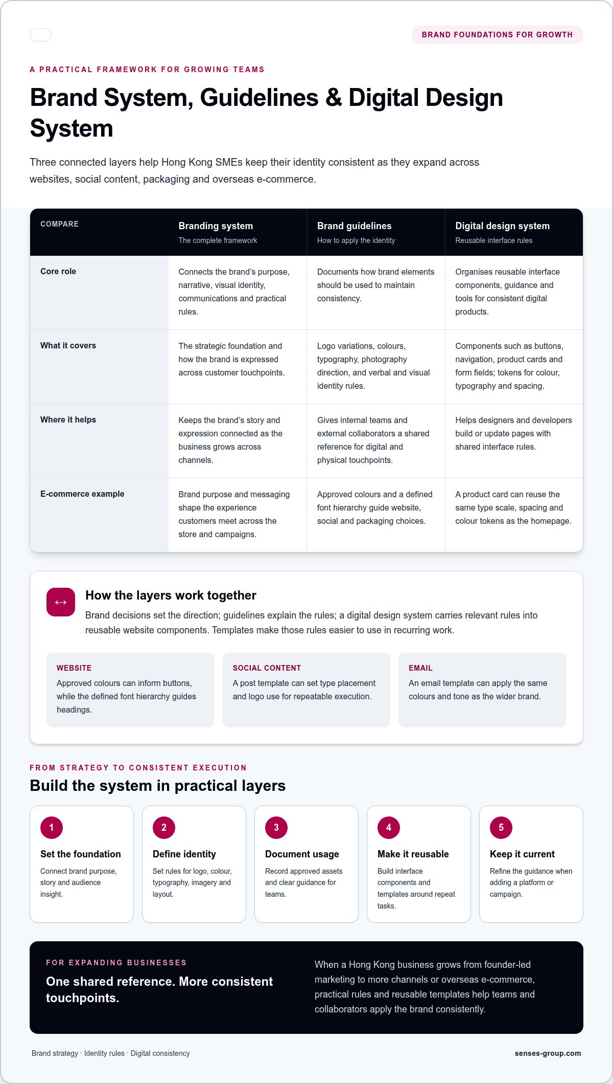
A branding system is the complete framework that brings a company’s brand elements together, while brand guidelines document how to apply them. This distinction matters as a business expands from founder-led marketing to multiple channels or overseas e-commerce. Guidelines help maintain consistency, while the wider system connects the brand’s purpose and messaging to its visual identity.
For example, guidelines might show logo variations, colours, typography and photography direction. The wider system explains how these choices express the brand’s positioning and tone. Guidelines can range from a concise reference to detailed rules for verbal and visual identity across digital and physical touchpoints.
Design System Components and Tokens
A digital design system organises reusable interface components, guidelines and tools so teams can create consistent digital products. Components might include buttons, navigation, product cards and form fields. Design tokens define shared values for colour, typography, spacing and other attributes, so a change to a value can be applied consistently wherever that token is used.
On an e-commerce website, a product card can use the same type scale, spacing and colour tokens as the homepage. A design system can also include logos, icons, fonts, a colour palette and a CSS style guide. Together, these elements give designers and developers a shared reference as they build pages or update an interface.
Connecting Brand Guidelines and Templates
Brand guidelines establish identity rules; a digital design system applies relevant rules to reusable website components. They work together when brand decisions inform interface choices, such as using approved colours for buttons and a defined font hierarchy for headings. This connection helps a website feel consistent with the wider brand.
Templates make the rules usable in recurring work. A social post template can set type placement and logo use, while an email template can apply the same colours and tone. For a growing business, document the approved assets and rules, then build templates around repeat tasks. That gives internal teams and external collaborators a practical foundation for consistent execution.
Colour, typography, imagery and layout systems
A visual framework turns brand choices into repeatable decisions across websites, campaigns and printed materials. Colour specifications, typography rules, imagery direction and layout principles all shape how customers recognise and navigate a brand.
Brand Colour Palettes and Specifications
A brand colour palette defines the approved colours and the role each plays in the identity. Its specifications help teams apply consistent choices across an online store, social content and print. Record colour values in relevant formats, then define each colour’s role, such as primary background, body text or call-to-action accent.
For example, a Hong Kong retailer might use a core palette across its Shopify storefront and product campaign graphics. Guidelines should clarify which combinations suit backgrounds and text, and which pairings to avoid. This prevents teams from selecting colours by eye and producing inconsistent results across platforms.
RGB, CMYK, and Pantone Modes
RGB, CMYK and Pantone specify colour for different production contexts. RGB values are used for digital screens, while CMYK values support process-colour printing. Pantone references identify specific spot colours when a print project calls for them. Recording these specifications helps teams translate a palette between websites and printed materials.
Keep relevant values together in the brand document. A digital banner can use its RGB or web colour values, while a brochure designer can refer to CMYK specifications. For a project using Pantone, include the chosen reference. The final appearance can still vary with screen settings, print methods and materials.
Typography and Colour Systems
A typography system defines typefaces and their hierarchy, including headings, body copy and labels. Together, typography and colour create a visual framework for emphasis and readability. For example, a product page can use a consistent heading style, legible description text and a defined accent colour for key actions.
Specify how type and colour work together across common formats. A campaign headline may use a display typeface, while product details use a more readable text style. Set rules for backgrounds, text and accents so each combination remains clear on mobile screens and desktop websites.
Imagery needs direction, too. Define the subject matter, lighting, composition and editing style that suit the brand. A lifestyle retailer might choose natural product scenes, consistent backgrounds and close-up detail shots. These decisions help product pages and social posts feel connected without making every image identical.
Layout principles organise these elements into usable pages. A grid, spacing rules and alignment guidance can shape a homepage, product listing and email campaign. For instance, consistent image proportions and product-card spacing help shoppers compare items as they move between categories. Document these patterns so future pages follow the same visual logic.
Treat the system as a working reference, not fixed decoration. When adding a platform or campaign, apply the documented palette, type hierarchy, imagery direction and layout rules. Refine the guidance when a genuine need arises. This keeps the brand coherent while allowing each format to serve its purpose.
Logo variations and usage rules
A logo system is a set of related logo assets, with rules for selecting and applying each version. It lets a business communicate the same identity on a website, product label, social profile and printed material, even when available space changes.
The core mark builds recognition, but one file rarely suits every format. A horizontal wordmark may fit a website header; a stacked version can work on a square social profile; a symbol may suit a favicon or compact product label. Each variation should follow the same design logic, rather than result from improvised edits.
Start by defining the role of each asset. Name the primary logo, secondary composition, symbol and monochrome version clearly in the asset library. Then show where each belongs. For an online store, use the horizontal mark in the desktop header, the compact symbol in a browser tab and the approved alternate on a narrow mobile layout.
Usage rules that protect the mark
Usage rules explain how to preserve a logo’s proportions, legibility and relationship to surrounding content. Document clear space, minimum display size, approved backgrounds and colour treatments. A logo on a pale product image may need a dark approved version; over a busy photograph, its details can be difficult to read.
Guidelines should also show what not to do. Don’t stretch the mark, rearrange its parts, add effects, substitute an unapproved typeface or place it on a low-contrast background. A visual example of each restriction gives designers, printers and marketing partners a quicker reference than a paragraph of warnings.
Logo and mark design in context
A wordmark uses the brand name as its central graphic element; a symbol can make the identity easier to recognise in compact placements. The choice should reflect the brand’s mission and audience, not a preference for decorative icons. For example, a specialist retailer may need its name prominent on product pages, while its symbol serves as a secondary cue on packaging.
Design details matter at different scales. Fine lines or small counters in letterforms can disappear in a tiny avatar, while a highly detailed symbol may compete with product photography. Review each variation in realistic contexts, such as a Shopify header, social avatar, email signature and printed insert, before approving the final assets.
For Hong Kong businesses serving customers in different markets, specify how the logo appears beside English or Chinese brand text, if both are part of the identity. Set alignment, spacing and hierarchy rather than creating ad hoc combinations. Keep the approved files and usage rules together so internal teams and external collaborators can select the correct version.
Treat logo rules as part of the wider identity system, not as permission to place the mark everywhere. Product imagery, headlines and layout also communicate the brand. A consistent logo system gives these elements a stable signature while letting each channel serve its purpose.
Imagery, iconography and graphic treatments
Photography, illustration, icons and graphic treatments give a visual identity its distinctive character. Define how each asset supports the brand’s positioning, then apply those choices across product pages, campaigns and social media. A clear framework helps teams choose visuals for a reason, not simply because an image looks attractive.
Photography guidelines should describe subjects, lighting, composition, backgrounds and editing. For a Hong Kong skincare store, this could mean natural product scenes, close-up texture details and uncluttered settings. Specify which images suit product pages and which support campaign storytelling. This gives photographers and marketers a shared reference without requiring every image to look identical.
Illustration can explain ideas that photography cannot show clearly. A food retailer might use simple ingredient illustrations to explain product origins, while photography shows the finished goods. Define the illustration style, line quality, colour use and level of detail. Then show how illustrations sit beside product photography, so both asset types support the same visual identity.
Iconography works best when its purpose and style are defined. Set a consistent approach to line weight, shape, corner treatment and fill. For example, shipping, care and ingredient icons on a product page should look like members of one family. Avoid mixing playful rounded symbols with sharp technical icons unless the contrast serves a clear communication purpose.
Icons also convey tone. Rounded shapes can feel approachable, while precise geometric forms can suggest structure; neither choice is right for every brand. Match the icon style to the verbal identity. If the brand voice is direct and expert, use clear symbols with straightforward labels. A cart icon beside “Add to basket” should support, not obscure, the action.
Graphic treatments include patterns, borders, frames, textures and recurring shapes. Define their role before adding them to layouts. A subtle pattern could distinguish campaign banners, while a bold frame might draw attention to a product benefit. Document where each treatment belongs and how it interacts with typography, imagery and colour.
Make the guidance usable with examples. Show an approved product photograph, a social media crop, an illustration and interface icons together. Include a contrasting example of an unsuitable treatment, such as a heavy filter that alters product colour. These references help teams assess new assets against the same standards.
For businesses selling across local and overseas markets, consider context when selecting imagery and symbols. A campaign photograph may need alternative crops for different platforms, while an icon’s meaning should remain clear beside its label. Review each asset in its intended placement, from a mobile product page to a promotional post, before adding it to the shared library.
Brand identity system design process
A strong process connects business direction to practical brand assets. It moves from discovery and strategy through design, documentation and real-world testing, so each decision supports a clear commercial purpose.
Begin with discovery. Review the target audience, business goals, current customer perception and existing touchpoints, such as the website, social media and packaging. For a Hong Kong startup planning overseas e-commerce, compare how the brand currently appears across local sales channels and international product pages. This reveals gaps between the intended personality and the customer experience.
Use those findings to establish strategy before developing visual concepts. Define the brand’s purpose, positioning, personality and promise, then identify what makes it distinct. For example, a specialty food retailer might need to communicate craftsmanship and convenience together. These strategic choices guide design decisions instead of leaving colour, typography and imagery to personal preference.
Next, develop design directions that translate the strategy into visible examples. Test logo concepts, colour choices, typography and imagery against realistic uses, including a product page, social post and packaging label. A concept that looks compelling on a presentation slide may become unclear in a small mobile header. Review each asset in context before refining the system.
Once the identity is established, document the rules and supporting assets. Include logo variations, colour specifications, typography hierarchy, image direction and layout examples. Add practical templates for recurring materials, such as campaign graphics or email headers. Clear guidance helps a growing team apply the system consistently without reinterpreting the original design choices.
There is no single typical duration for a brand identity design project. The schedule depends on the scope, research required, decision-makers, feedback cycles and deliverables, such as packaging or digital templates. A focused identity update has different demands from a project that also defines strategy and creates assets for several markets.
For Hong Kong audiences, make the system accessible through clear mobile layouts, readable text and language choices suited to the customer base. If the brand communicates in English and Traditional Chinese, define how both languages appear in headings, navigation and product information. Test actual storefront pages with local customers, then adapt content and examples for overseas audiences without losing the brand’s core personality.
Avoid rushing from a logo sketch to launch without strategy, usage rules or realistic testing. Also avoid copying familiar category graphics, using photography without permission, or adopting fonts and illustrations without understanding their usage rights. Before launch, review the identity for distinctiveness and document asset ownership and permissions. These steps reduce avoidable disputes and help protect the brand’s integrity.
When the strategy and design need to work as one, develop a cohesive brand identity grounded in your business goals.
Senses Group: Brand Strategy
Senses Group helps businesses connect brand direction with a coherent identity and digital customer experience. Its Brand Strategy and Brand Identity Design can support Hong Kong SMEs and startups that need clearer positioning, consistent assets or a stronger foundation for entering overseas e-commerce markets.
For businesses ready to turn that foundation into a sales channel, an Ecommerce Shopify Store brings the identity into the online shopping experience. Klaviyo Email Automation supports customer communication after a visit or purchase. These services fit when brand decisions need to carry through from strategy and design into online commerce.
If your brand needs clearer direction or a system built to support growth, contact Senses Group to discuss your goals, or visit senses-group.com.
Make your brand ready for its next stage
Your next step is to decide what your brand needs to make possible as the business grows. Brand identity system design should support clear decisions across customer touchpoints and future priorities, whether you’re expanding into e-commerce or overseas markets. Use that direction to identify what needs attention now and what the brand must be ready to support next.
Consider where customers encounter uncertainty, from first impressions to the shopping experience. These friction points can help you prioritise which parts of the brand need clearer direction before investing in further growth.
Share your priorities with Senses Group and discuss your brand’s next stage. A considered direction can give your business a stronger basis for moving forward with purpose.
Frequently Asked Questions
What are brand guidelines?
Brand guidelines are the working reference people use to make consistent brand decisions. Make them easier to apply by naming an owner, recording the current version and explaining how updates are approved. For example, a marketing team preparing a campaign can use the document to resolve a question about tone or layout, then flag any rule that needs review instead of creating a one-off exception.
What is brand identity?
Brand identity is the set of choices a business makes to express itself, while brand image is how audiences perceive it. This distinction matters when customer feedback differs from the intended impression. If a company aims to feel premium but its product pages appear generic, it can review the customer experience and adjust the signals shaping perception.
What is a brand identity system and what elements does it include?
A brand identity system gives a business a shared structure for making identity decisions as it changes. Alongside core visual and verbal assets, consider how teams maintain the system: who manages files, how new materials are approved and how updates reach collaborators. When a retailer adds a product category, this governance helps the launch fit the established brand.
How to create brand positioning, values, voice, and messaging for a brand?
Base these decisions on evidence about customers and the market, not internal preference alone. Review customer feedback, compare how alternatives describe their value and identify a credible reason to choose your business. Turn that reason into a clear promise, then write sample headlines and product descriptions. Test whether the wording feels distinctive and understandable to the intended audience.
What are the essential brand guidelines and deliverables for a visual identity system?
Prioritise deliverables according to who will use them and what they need to produce. A small team may need editable templates and clearly named files, while developers need source assets suited to the website. Make ownership and access clear, and provide examples that show the rules in context. This reduces delays caused by searching for files or recreating approved materials.
How to choose typography, colors, logo variations, and imagery for a cohesive brand identity?
Assess each choice against real customer tasks instead of selecting elements in isolation. Preview the identity on a product listing, a mobile screen and a promotional message. Check that key information remains legible, the logo suits each placement and imagery supports the intended impression. If the business serves audiences using different languages, test representative text before finalising layouts.