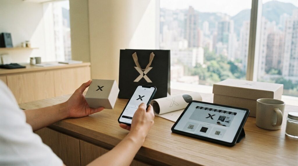
What if the logo that looks distinctive on a business card disappears on a mobile screen or product page? For Hong Kong businesses selling through social media, ecommerce and overseas markets, logo design for businesses Hong Kong must solve more than an aesthetic challenge. A logo needs to express what sets your business apart and remain recognisable wherever customers encounter it.
It’s understandable to judge a design by whether you like how it looks. But personal taste alone won’t tell you whether it reflects your strategy, works at different sizes or supports a consistent customer experience. The strongest logo is not an isolated graphic. It’s a practical brand asset built to serve the business as it grows.
This article explains how to brief a designer around your positioning, compare concepts using clear commercial and functional criteria, and assess the assets and guidance your identity needs. You’ll also learn how a consistent visual identity can carry from a retail setting to a Shopify store and overseas marketing, creating a stronger foundation for recognition and growth.
Key Takeaways
- Define your business goals and audience before exploring visual concepts, so design decisions have a clear strategic basis.
- Evaluate logo design for businesses Hong Kong against clarity, distinctiveness, legibility, adaptability and strategic fit, not personal preference alone.
- Test concepts across practical brand touchpoints, including Shopify storefronts, social profiles, packaging and marketing materials.
- Give the design team a focused brief covering your brand story, intended audiences, positioning and plans for expansion.
- Look for a joined-up identity system where the logo, colours, typography and guidelines work together to support consistent customer experiences.
What Does Logo Design for Businesses in Hong Kong Need to Achieve?
A logo earns its place by helping customers identify a business and distinguish it from alternatives. It cannot carry the whole brand, though. Recognition develops through repeated, consistent experiences: customers see a visual mark, connect it with a business, then form an impression through the products, service and messages that follow.
That’s why a logo is not decoration added after the commercial decisions are made. It should express the business’s position in the market and support a coherent customer experience. For SMEs building recognition locally and preparing to sell overseas, logo design for businesses Hong Kong should be judged by how clearly and consistently it represents the business in use, not only by how appealing it looks in a presentation.
Logo, brand identity and brand strategy: how they differ
Brand strategy is the foundation. It clarifies who the business serves, what makes its offer distinct, how it wants to be positioned and what story customers need to understand. These decisions give design a direction. Without them, a logo can look polished yet communicate little about why customers should pay attention.
The logo translates selected strategic ideas into a visual mark. The broader identity system includes colours, typography, supporting visual assets and guidelines that shape how the brand appears across communications. A logo is the identifying mark; the brand identity system is the set of visual rules that makes the brand recognisable and consistent wherever that mark appears. For background on the discipline, The concept and history of logo design offers a wider overview.
Why Hong Kong SMEs need a logo that travels across markets
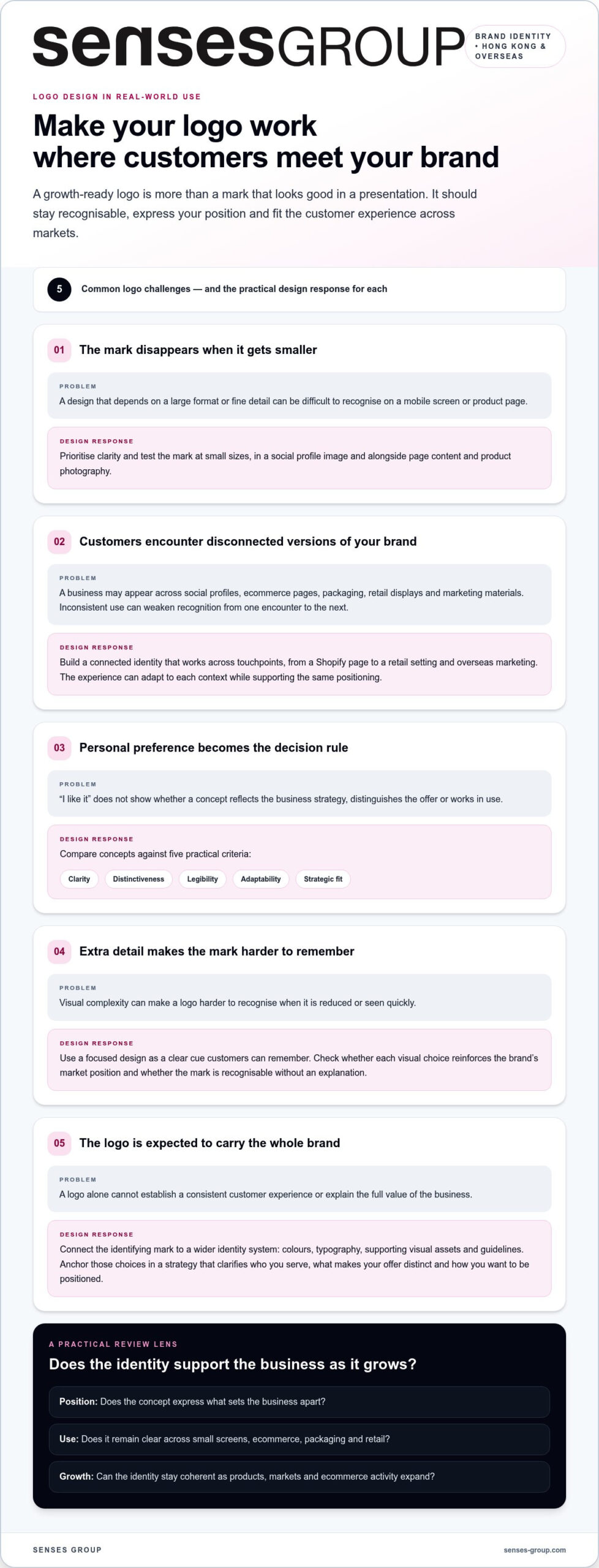
A growing business may appear first on a social profile, then on an ecommerce page, product packaging or marketing material. Customers should be able to recognise the same business across those encounters, whether they’re shopping locally or viewing the brand from overseas. A mark that depends on a large format or a specific background can be difficult to apply consistently in different settings.
Assess whether the design remains clear at small sizes, works in a profile image and sits comfortably alongside product photography and page content. Consider how it will look on a retail display as well as a Shopify page. The goal isn’t to make every touchpoint identical. It’s to create a connected experience in which the logo and wider identity support the same positioning.
Clarity and distinctiveness matter more than visual complexity. Extra details can make a logo harder to recognise when it’s reduced or viewed quickly. A focused design gives customers a clear cue to remember, while consistent use gives that cue meaning over time. Ask whether each visual choice reinforces the brand’s position and whether the mark remains recognisable without an explanation. If it doesn’t, the answer may be greater clarity, not more decoration.
How Should Business Strategy Shape a Hong Kong Logo Design?
A logo concept becomes commercially useful when it answers a business need. Before choosing shapes, colours or type, clarify what the business is working towards, who it needs to reach and why customers should choose it. That sequence keeps creative decisions anchored to the company’s direction, rather than to a passing visual trend or personal preference.
Strategic clarity turns logo design from a taste-based choice into a series of purposeful decisions. For logo design for businesses Hong Kong, that means establishing a foundation that can support growth from local sales into overseas ecommerce, without losing a recognisable point of view.
Build the brief around audience, positioning and brand story
Start by naming the audiences the business needs to reach and the perception it wants to establish with them. A startup seeking to signal specialist expertise has a different task from a consumer brand aiming to feel accessible and distinctive. Then define the market distinction the logo should express: what customers can expect from the offer and what sets it apart from alternatives. Avoid prescribing a symbol before these points are clear.
Include the brand story and growth ambitions in the brief. Note how customers currently discover and buy, which products or services anchor the offer, and where the business intends to sell next. For an SME planning overseas ecommerce, this context helps the identity remain coherent across audiences and channels without assuming that one visual convention will work everywhere.
Turn strategy into a focused creative direction
With the brief in place, develop concepts that translate the business’s story and positioning into considered visual choices. Each concept should have a clear rationale: what idea it expresses, how it helps distinguish the business and why it suits the intended customer experience. This creates a useful basis for comparing options beyond “I like it” or “it feels modern.”
Review each direction against the promise customers should perceive. Does it support the intended position? Does it feel credible beside the product, price point and tone of communication? Could it remain coherent as the business adds products, reaches new markets or expands its ecommerce activity? A logo can reference the brand story without illustrating it literally. The Golden rules for effective logo design can also inform decisions about keeping the mark purposeful and usable.
Use a practical sequence to guide the project:
- Clarify goals: Define the business outcome the identity needs to support.
- Define audiences: Identify priority customers and the impression the brand should leave.
- Map positioning: State the offer’s meaningful distinction in the market.
- Develop concepts: Translate the strategy into visual directions with a clear rationale.
- Test applications: Review the strongest options in relevant ecommerce and marketing contexts.
Because the identity works as a system, not only as a mark, retail brand identity design provides context for aligning visual choices across customer touchpoints. If your brief needs to connect brand direction with ecommerce growth, learn more about Senses Group’s branding approach.
How to Evaluate Logo Concepts Across Ecommerce and Brand Touchpoints
A concept can look compelling on a large presentation board and still become unclear as a small social profile image. Judge each option in the contexts where customers will actually meet the brand, not only in the format used to present it. A strong logo concept stays recognisable across the touchpoints where customers need to find and understand the brand.
A practical evaluation for logo design for businesses Hong Kong should connect the approved brief with real applications. Compare concepts consistently, then test how each works beside the business’s products, messaging and wider visual identity.
A practical scorecard for comparing logo concepts
Use the same criteria for every option. Review each concept against the intended audience and positioning, rather than letting individual taste become the only measure. A simple scorecard can identify strengths, trade-offs and questions to resolve before you select a direction.
| Criterion | What to assess |
|---|---|
| Clarity | Can customers recognise the mark quickly, without needing an explanation? |
| Distinctiveness | Does it give the business a clear visual cue that separates it from similar offers? |
| Legibility | Can lettering and details still be read at small sizes, and does the design remain clear on light and dark backgrounds? |
| Adaptability | Can it work in different placements, with suitable versions where a compact format is needed? |
| Strategic fit | Does it express the intended position and feel appropriate to the audience and offer? |
Use a qualitative comparison, such as “strong,” “needs adjustment” or “unclear,” rather than inventing a numerical score or benchmark. Note the evidence behind each judgement. If a concept feels distinctive but loses legibility when reduced, record that specific issue instead of approving or rejecting it on instinct.
Test logo applications before choosing a final direction
Mock up each leading option in realistic settings: a Shopify storefront header, a social profile, product packaging and marketing materials. For storefront decisions, the strategic Shopify guide for Hong Kong SMEs provides relevant ecommerce context. Check the logo both on its own and beside the identity’s typography, colour and other visual elements.
Test a large storefront placement alongside compact uses such as a profile icon or mobile header. A detailed arrangement may need a simplified or stacked variation for smaller spaces; the aim is to preserve recognition, not force one lockup into every format. Review contrast against light and dark backgrounds, and make sure surrounding page content doesn’t crowd the mark.
Finally, view the same applications as part of a local and overseas customer journey. Does the identity feel consistent from social discovery to product page and packaging? Does the logo remain clear when the language or layout around it changes? These checks reveal whether the concept can support real business use, rather than merely looking finished in a design presentation.
What Should a Logo Design Project Include from Brief to Brand Guidelines?
A useful logo project moves through connected decisions, not a rush from inspiration to artwork. It begins with business discovery, where the team clarifies goals, audiences, brand story and growth priorities. Strategy establishes the direction; concept development explores visual ways to express it; refinement sharpens the selected route; and brand guidelines help people apply the identity consistently.
For logo design for businesses Hong Kong, the brief should reflect how the company operates now and where it plans to grow. An SME preparing to sell through ecommerce locally and overseas needs to consider where customers will encounter its identity, from storefront and packaging to digital campaigns. Clear input at the start helps the design process solve a business problem rather than simply produce an attractive mark.
Prepare a useful business logo brief
Give the design team a practical picture of the business: what it sells, who its customers are, what customers should understand about the brand and what makes the offer distinct. Include the brand story and growth priorities, such as entering new markets or strengthening online sales. The brief should explain desired outcomes, not dictate a symbol before the strategy is clear.
List the intended applications so the work can be considered in context. Useful examples include:
- Shopify storefront and product pages
- Social profiles and ongoing social content
- Product packaging and retail displays
- Marketing materials, including digital campaigns
Share visual references that explain what feels relevant or unsuitable, and add a short note about why. Distinguish inspiration from imitation: references can communicate qualities such as simplicity or warmth, but the identity should express your own business’s position and story.
Move from identity design to consistent brand use
Once a concept is refined, brand guidelines give the team a shared reference for using the approved logo, colours and typography. They clarify how the visual elements work together and help reduce improvised variations across marketing activity. This matters as a business grows, when founders, staff and external collaborators may all prepare customer-facing materials.
Apply the guidance to real work. On a Shopify storefront, check that the logo sits comfortably with product imagery, page typography and colour choices. In marketing materials, maintain the same visual character while adapting the layout to each channel. The goal is not to make every execution identical; it is to ensure each one feels part of the same brand. A broader brand foundation helps connect these choices across customer touchpoints.
Build a brief that connects your business goals to a consistent identity. Explore Senses Group’s brand identity design as part of a foundation for your ecommerce and marketing needs.
How Senses Group Connects Logo Design to a Growth-Ready Brand
A logo has more value when it’s built into a brand system that can support the business beyond its launch. For SMEs considering logo design for businesses Hong Kong, the practical question is not only what the mark looks like, but how it connects to the story customers encounter across the buying journey.
Senses Group’s Branding service brings together brand strategy, story, logo, colour, typography, visual identity and guidelines. Founded in 2008, the agency brings more than 18 years of branding and marketing expertise as of 2026. Its integrated approach starts by clarifying the commercial direction, then develops an identity that expresses it and can be applied across customer-facing channels.
Build a consistent identity, not a standalone mark
Strategic foundations shape the identity’s role. The business’s audience, positioning and story inform decisions about the logo, colours, typography and supporting visual elements. Guidelines then give the team a shared reference for applying those elements, helping maintain a recognisable presence across digital and physical materials.
This consistency matters in everyday execution. A campaign, product page and package may each have a different layout, yet should still feel connected to the same business. Senses Group’s experience includes work with global brands, as well as building and scaling a home-family product brand from its foundations. The key is to make the identity serve the brand’s context and ambitions, rather than follow a one-size-fits-all formula.
Make the identity work within an ecommerce growth system
A growth-ready identity should fit the customer journey from discovery to purchase and follow-up. On a Shopify storefront, the logo and wider visual language need to work alongside product imagery, page design and key messages. Marketing content and customer communications should carry the same identity, so recognition builds across touchpoints rather than resetting with every interaction.
That alignment makes the identity more usable as the business expands its ecommerce activity. Brand guidelines help keep visual decisions consistent, while the broader marketing system connects the storefront with campaigns and ongoing customer communication. Senses Group combines brand foundations with Shopify ecommerce and digital marketing as part of an integrated growth system.
If your current logo feels disconnected from the customer experience you’re building, consider how strategy, identity and ecommerce can work as one system. A focused discussion about your business goals can help clarify where the brand needs greater alignment. Build a growth-ready brand with Senses Group.
Give Your Brand a Stronger Foundation for Growth
The value of logo design for businesses Hong Kong lies in what it enables next: a clearer presence, a more consistent customer experience and a visual foundation that can support the business as it reaches new markets. Treat your identity as a working asset. As your offer or sales channels evolve, review whether it still reflects your position and feels connected across customer touchpoints.
A practical next step is to identify where your brand needs to create greater clarity for customers, whether on your ecommerce storefront, in marketing or across the buying journey. From there, align the identity with the wider systems that carry your brand into the market. Senses Group connects brand strategy and identity with Shopify ecommerce and digital marketing, bringing those growth requirements into the same conversation.
Build an identity that can move with your business, not just mark its starting point. Build a growth-ready brand with Senses Group and take your next step with a stronger foundation.
Frequently Asked Questions
What should a business logo communicate?
A business logo should give customers an appropriate first cue about the company, without trying to make every product claim at once. Decide what customers should grasp quickly, such as the business name, category or intended level of service. Then check whether the mark supports that impression in the settings where customers first encounter it. Product descriptions and other brand communications can explain the offer in greater detail.
How much does logo design for a business cost?
The cost depends on the work involved and the scope agreed for the project. Make comparisons more meaningful by describing your needs clearly and checking whether proposals cover strategy, identity development, revisions and final assets. Don’t compare headline prices alone if the included work differs. For an SME managing a set budget, prioritise what the business needs to launch and apply the identity effectively.
How long does it take to design a business logo?
Project timing varies with the agreed scope, decision-making process and how promptly the business provides feedback. Before starting, identify who has approval authority and arrange a way to collect comments in one place. Conflicting feedback from several stakeholders can slow decisions or pull the design in different directions. If the logo is tied to a store launch or campaign, build the design review into the broader project schedule.
Can one logo work for ecommerce and overseas markets?
A business can often use one core logo across ecommerce and overseas activity, but should assess the mark in the specific contexts it plans to enter. Check how the business name reads in the intended market and whether surrounding product information is clear to customers there. If the company changes its offer, naming or audience, review the identity before rolling it into new storefronts or campaigns.
What files and guidelines should a business receive with its logo?
Before approving a handover, clarify which files are editable, which are ready for everyday use and how the business may use the artwork. Ask how the files are named and organised so staff can find the right version without relying on the designer. It’s also useful to decide who internally maintains the approved assets and how future changes will be managed, especially when several people create marketing materials.
Should a startup create a logo before defining its brand strategy?
A startup can explore visual ideas early, but should avoid treating an initial concept as a settled business identity before its offer and audience are clear. If the business is still testing its model, document the assumptions behind the design and the decisions that could change as customer feedback comes in. This gives the team a basis for deciding whether the identity still fits as the company develops.
How often should a business redesign its logo?
There’s no fixed redesign schedule. Review the logo when a meaningful business change raises a practical concern, such as a changed company name, a major shift in the offer or a design that no longer works in an important channel. Before commissioning a redesign, record the specific problem and decide how success will be judged. That keeps the decision grounded in business needs rather than a passing preference.
Is a logo the same as a brand identity?
No. A logo is a single asset; brand identity covers the wider visual expression of a business. The distinction is useful when assigning responsibility: a logo file can be supplied once, while teams still need agreed practices for creating campaign materials and keeping older ones current. Clear internal ownership helps prevent outdated artwork or unapproved variations from circulating across customer communications.